728x90
import matplotlib.pyplot as plt
import numpy as np
import pandas as pd
import seaborn as sns
# Windows용 한글 폰트 오류 해결
from matplotlib import font_manager, rc
font_path = "C:/Windows/Fonts/malgun.ttf"
font_name = font_manager.FontProperties(fname = font_path).get_name()
rc("font", family = font_name)
꺾은 선 그래프
- 연속적으로 변화하는 데이터를 살펴보고자 할 때 주로 사용
- 시간에 따른 데이터의 연속적인 변화량을 관찰할 때
- 예) 시간에 따른 기온의 변화
- 시간에 따른 데이터의 연속적인 변화량을 관찰할 때
- 수량을 점으로 표시하면서 선으로 이어 그리기 때문에 증가와 감소 상태를 쉽게 확인할 수 있음
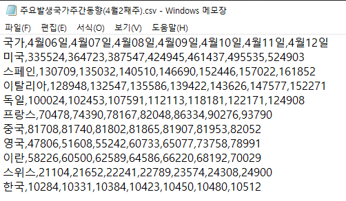
df = pd.read_csv("./data/주요발생국가주간동향(4월2째주).csv", index_col = "국가")
df.head()

chartdata = df["4월06일"]
chartdata
국가
미국 335524
스페인 130709
이탈리아 128948
독일 100024
프랑스 70478
중국 81708
영국 47806
이란 58226
스위스 21104
한국 10284
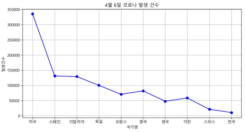
Name: 4월06일, dtype: int64fig = plt.figure(figsize = (10, 5))
plt.plot(chartdata, "b-o") #blueㅇ
plt.grid() #격자
plt.xlabel("국가명")
plt.ylabel("발생건수")
plt.title("4월 6일 코로나 발생 건수")
plt.show()
# 시리즈의 인덱스가 x축, data값이 y축에 표시됨
chartdata = df.loc[["스페인", "프랑스", "독일", "중국", "영국", "이란"], :"4월10일"]
chartdata = chartdata.T
chartdata
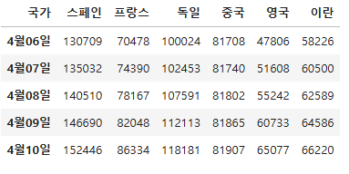
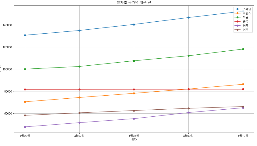
fig = plt.figure(figsize = (15, 8))
plt.plot(chartdata, marker = "o")
plt.legend(chartdata.columns, loc = "upper right")
plt.title("일자별 국가명 꺾은 선")
plt.xlabel("일자")
plt.ylabel("국가명")
plt.grid()
plt.show()
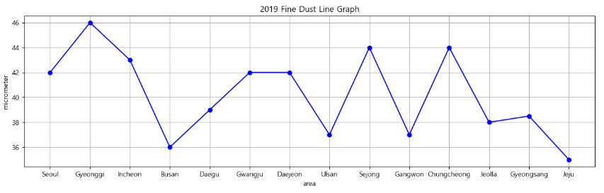
미세먼지 예제
- 2019년도 미세먼지 선그래프 그리기
data = pd.read_excel("./data/fine_dust.xlsx", index_col = "area")
data.head()
data.columns
Index([2001, 2002, 2003, 2004, 2005, 2006, 2007, 2008, 2009, 2010, 2011, 2012,
       2013, 2014, 2015, 2016, 2017, 2018, 2019],
      dtype='int64')
data[2019]
area
Seoul          42.0
Gyeonggi       46.0
Incheon        43.0
Busan          36.0
Daegu          39.0
Gwangju        42.0
Daejeon        42.0
Ulsan          37.0
Sejong         44.0
Gangwon        37.0
Chungcheong    44.0
Jeolla         38.0
Gyeongsang     38.5
Jeju           35.0
Name: 2019, dtype: float64
plt.figure(figsize = (15, 4))
plt.plot(data[2019], "bo-") #blueㅇ
plt.grid() #격자
plt.xlabel("area")
plt.ylabel("micrometer")
plt.title("2019 Fine Dust Line Graph")
plt.show()
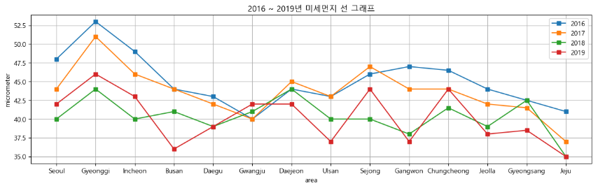
- 2016 ~ 2019년 지역별 미세먼지 선 그래프 그리기
plt.figure(figsize = (15, 4))
for year in range(2016, 2020):
chartdata = data[year]
plt.plot(chartdata, "s-", label = year)
plt.xlabel("area")
plt.ylabel("micrometer")
plt.title("2016 ~ 2019년 미세먼지 선 그래프")
plt.legend()
plt.grid()
plt.show()
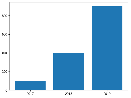
막대 그래프
- 집단별 차이를 표현할 때 주로 사용
- 크고 작음의 차이를 한 눈에 파악하기 위해
- 예) 수량의 많고 적음 비교, 변화된 양에 대한 일별, 월별, 연별 통계 등의 비교
- 가독성 면에서 막대 그래프는 일반적으로 항목의 개수가 적으면 가로 막대가 보기 좋고, 항목이 많으면 세로 막대가 보기 편함
x = np.arange(3)
years = ["2017", "2018", "2019"]
values = [100, 400, 900]
plt.bar(x, values)
plt.xticks(x, years)
plt.show()
x = np.arange(3)
years = ["2017", "2018", "2019"]
values = [100, 400, 900]
plt.bar(x, values, width = 0.6, align = "edge", color = "springgreen", edgecolor = "gray",
linewidth = 3, tick_label = years, log = True) #변화 비율을 보고싶으면 log스케일로 설정
# plt.xticks(x, years) ->tick_label = years로 대체
plt.show()

※ 시각화 사이트
https://www.portfoliovisualizer.com/
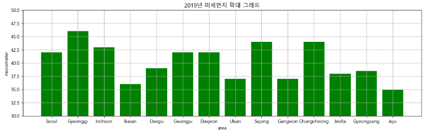
미세먼지 세로 막대 그래프
- 2019년 지역별 미세먼지 세로 막대 그래프
plt.figure(figsize = (15, 4))
plt.bar(data[2019].index, data[2019], color = "g")
plt.xlabel("area")
plt.ylabel("micrometer")
plt.title("2019년 미세먼지 막대 그래프")
plt.grid()
plt.ylim(30, 50) #축의 범위를 최소30 최대50로 설정 : 막대의 변화량을 상세하게 보고 싶은 경우
plt.show()
그룹 세로 막대 그래프
- 2016 ~ 2019년 데이터를 막대 그래프로 그리기
index = np.arange(4)
plt.figure(figsize = (15, 4))
data_bar = data.loc["Gyeonggi":"Daegu", 2016:2019]
for year in range(2016, 2020):
chartdata = data_bar[year]
plt.bar(index, chartdata, width = 0.2, label = year)
index = index + 0.2 #넘파이는 복합대입연산자 기능이 없으므로 index += 0.2가 안됨
plt.xlabel("area")
plt.ylabel("micrometer")
plt.legend()
plt.xticks(index - 0.5, ["경기", "인천", "부산", "대구"])
plt.ylim(35, 55)
plt.show()

수평 막대 그래프
x = np.arange(3)
years = ["2017", "2018", "2019"]
values = [100, 400, 900]
plt.barh(x, values, height = 0.6, align = "edge", color = "springgreen", edgecolor = "gray",
linewidth = 3, tick_label = years, log = True) #변화 비율을 보고싶으면 log스케일로 설정
# plt.xticks(x, years) ->tick_label = years로 대체
plt.show()

산점도
- 서로 다른 두 연속형 변수 사이의 관계를 나타내며 연속형 변수의 상관성을 확인할 때 산점도 그래프를 사용
- 예) 나이와 소득에 대한 상호 관련성 파악
- 산점도에 표시되는 각 점들은 자료의 관측값을 의미하고, 각 점의 위치는 관측값이 가지는 x축, y축 변수의 값으로 결정됨
N = 50
x = np.random.rand(N)
y = np.random.rand(N)
colors = np.random.rand(N)
area = (30 * np.random.rand(N)) ** 2
plt.scatter(x, y, s = area, c = colors, alpha = 0.5)
plt.show()

Tips 데이터 산점도 그래프
tips = sns.load_dataset("tips")
tips.head()

type(tips)
pandas.core.frame.DataFramefig = plt.figure()
axes1 = fig.add_subplot(1, 1, 1)
axes1.scatter(tips["total_bill"], tips["tip"])
axes1.set_title("Total Bill vs Tip 산점도")
axes1.set_xlabel("Total Bill")
axes1.set_ylabel("Tip")
plt.show()

2020년 건강검진 데이터 산점도 그래프
- 키(height), 몸무게(weight) 산점도 그래프
health = pd.read_excel("./data/health_screenings_2020_1000ea.xlsx")
health.head()
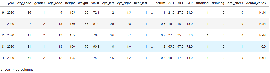
health.shape
(1000, 30)
health["year"].unique()
array([2020], dtype=int64)
health.columns
Index(['year', 'city_code', 'gender', 'age_code', 'height', 'weight', 'waist',
       'eye_left', 'eye_right', 'hear_left', 'hear_right', 'systolic',
       'diastolic', 'blood_sugar', 'cholesterol', 'triglycerides', 'HDL',
       'LDL', 'hemoglobin', 'urine_protein', 'serum', 'AST', 'ALT', 'GTP',
       'smoking', 'drinking', 'oral_check', 'dental_caries', 'tartar',
       'open_date'],
      dtype='object')
plt.figure(figsize = (10, 4))
plt.scatter(health["height"], health["weight"])
plt.xlabel("height")
plt.ylabel("weight")
plt.title("2020 Health Screening Scatter Graph")
plt.grid()
plt.show()

히스토그램
- 변수가 하나인 데이터의 빈도수를 막대 모양으로 나타낼 때 사용
- 통계분석에서 히스토그램은 가장 많이 사용되는 도구로, 데이터의 분석 및 분포를 파악하는 역할을 함
- x축에는 계급, y축에는 해당 도수 및 비율(개수)을 지정
- 계급은 변수의 구간을 의미
- 서로 겹치지 않아야 하고 계급들은 서로 붙어 있어야 함
weight = np.random.randint(55, 80, 22)
plt.hist(weight)
plt.show()

weight
array([78, 68, 73, 65, 72, 58, 72, 66, 64, 57, 75, 60, 63, 64, 60, 55, 58,
       62, 68, 61, 57, 59])
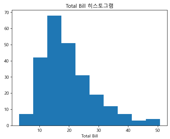
Tips 히스토그램
plt.hist(tips["total_bill"], bins = 10)
plt.title("Total Bill 히스토그램")
plt.xlabel("빈도")
plt.xlabel("Total Bill")
plt.show()
건강검진 데이터 남성 키 히스토그램
- gender : 1(남성)
male_data = health.loc[health["gender"] == 1, ["gender", "height"]]
male_data.head()
plt.figure(figsize = (10, 6))
plt.hist(male_data["height"], bins = 7, label = "Male") #bins로 구간을 줄임
plt.xlabel("height")
plt.ylabel("frequency")
plt.title("2020 Health Screenings Male Height Histogram")
plt.legend()
plt.grid()
plt.xlim(140, 200) #x부분 조정
plt.show()

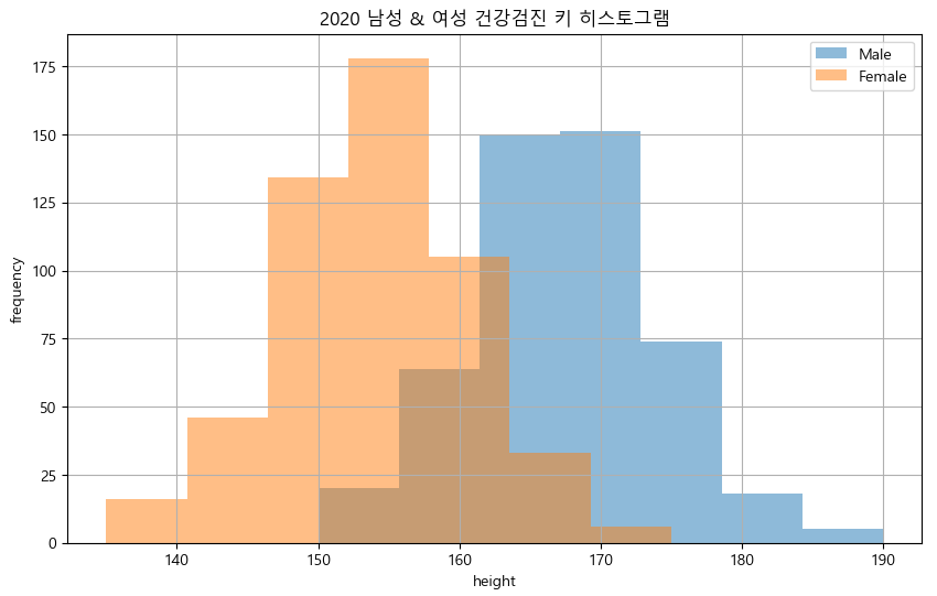
그룹 히스토그램
- 남성 및 여성 키 그룹 히스토그램
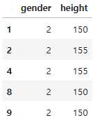
female_data = health.loc[health["gender"] == 2, ["gender", "height"]]
female_data.head()
plt.figure(figsize = (10, 6)) #피규어 사이즈를 지정해서 크기를 조정
plt.hist(male_data["height"], bins = 7, label = "Male", alpha = 0.5) #bins로 구간을 줄임
plt.hist(female_data["height"], bins = 7, label = "Female", alpha = 0.5) #bins로 구간을 줄임
plt.xlabel("height")
plt.ylabel("frequency")
plt.title("2020 남성 & 여성 건강검진 키 히스토그램")
plt.legend()
plt.grid()
# plt.xlim(140, 200) #x부분 조정
plt.show()
파이차트
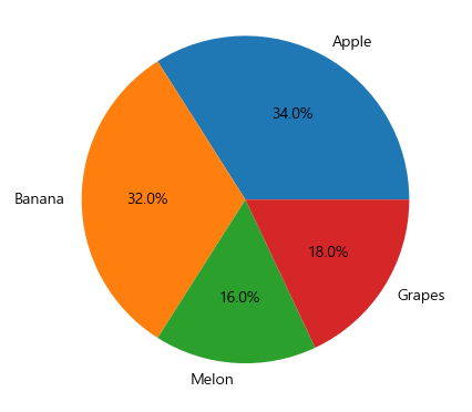
ratio = [34, 32, 16, 18]
labels = ["Apple", "Banana", "Melon", "Grapes"]
plt.pie(ratio, labels = labels, autopct = "%.1f%%") # 소수점이하 첫째자리의 float형, %%: 퍼센트라는 특수기호
plt.show()
ratio = [34, 32, 16, 18]
labels = ["Apple", "Banana", "Melon", "Grapes"]
plt.pie(ratio, labels = labels, autopct = "%.1f%%", startangle = 260, counterclock = False)
# startangle에 설정한만큼 회전한 위치에서 파이를 시작
# counterclock = False 시계방향으로 변경
plt.show()

ratio = [34, 32, 16, 18]
labels = ["Apple", "Banana", "Melon", "Grapes"]
explode = [0, 0.1, 0, 0.1]
# explode 원점에서 떨어뜨림, shadow:그림자설정
plt.pie(ratio, labels = labels, autopct = "%.1f%%", startangle = 260, counterclock = False, explode = explode, shadow = True)
plt.show()

상자수염 그래프
- 데이터분포를 시각화하여 탐색하는 방법으로 상자수염 그래프를 사용
Tips
plt.boxplot([tips.loc[tips["sex"] == "Female", "tip"],
tips.loc[tips["sex"] == "Male", "tip"]],
tick_labels = ["Female", "Male"])
plt.xlabel("성별")
plt.ylabel("Tip")
plt.show()

건강검진 데이터 남성 및 여성 키 상자수염 그래프
import matplotlib
matplotlib.__version__
'3.9.2'
plt.boxplot([male_data["height"], female_data["height"]], tick_labels = ["Male", "Female"])
plt.xlabel("gender")
plt.ylabel("height")
plt.show()

seaborn
- matplotlib을 기반으로 다양한 테마와 통계용 차트 등의 동적인 기능을 추가한 시각화 라이브러리
- 통계와 관련된 차트를 제공하기 때문에 데이터프레임으로 다양한 통계 지표를 낼 수 있으며 데이터 분석에 활발히 사용되고 있음
- 실제 분석에서는 matplotlib과 seaborn 두 가지를 함께 사용
- seaborn은 기본적으로 matplotlib보다 제공하는 색상이 더 많기 때문에 색 표현력이 더 좋음
히스토그램
ax = sns.histplot(tips["total_bill"], kde = True) # histplot: 히스토그램의 subplot, kde = True: 밀집도 그래프 포함
ax.set_title("Total Bill Histogram")
plt.show()

건강검진 데이터 남성과 여성의 허리둘레 히스토그램
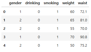
health.loc[:, ["gender", "drinking", "smoking", "weight", "waist"]].head()
health["gender"] = health["gender"].map(lambda x: "Male" if x == 1 else "Female")
health["drinking"] = health["drinking"].map(lambda x: "Non-drinking" if x == 0 else "Drinking")
health["smoking"] = health["smoking"].map(lambda x: "Smoking" if x == 3 else "Non-smoking")
male_data = health.loc[health["gender"] == "Male", ["gender", "weight", "waist", "drinking", "smoking"]]
female_data = health.loc[health["gender"] == "Female", ["gender", "weight", "waist", "drinking", "smoking"]]
plt.figure(figsize = (10, 6))
sns.histplot(male_data["waist"], alpha = 0.5, label = "Male", kde = True, bins = 7) #bins:구간 수
sns.histplot(female_data["waist"], alpha = 0.5, label = "Female", kde = True, bins = 7, color = "r")
plt.xlabel("waist")
plt.ylabel("count")
plt.legend()
plt.grid()
plt.show()

count 그래프
tips

ax = sns.countplot(data = tips, x = "day") #tips: 자동으로 세서 그래프를 그려줌
ax.set_title("Count of days")
ax.set_xlabel("요일")
ax.set_ylabel("Frequency")
plt.show()

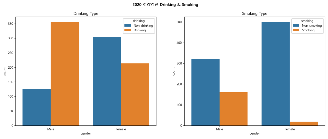
건강검진 데이터 count 그래프
fig = plt.figure(figsize = (17, 6))
area1 = fig.add_subplot(1, 2, 1)
area2 = fig.add_subplot(1, 2, 2)
sns.countplot(data = health, x = "gender", hue = "drinking", ax = area1) # hue컬럼을 기준으로 x를 나누어줌
sns.countplot(data = health, x = "gender", hue = "smoking", ax = area2)
fig.suptitle("2020 건강검진 Drinking & Smoking", fontweight = "bold")
area1.set_title("Drinking Type")
area2.set_title("Smoking Type")
plt.show()
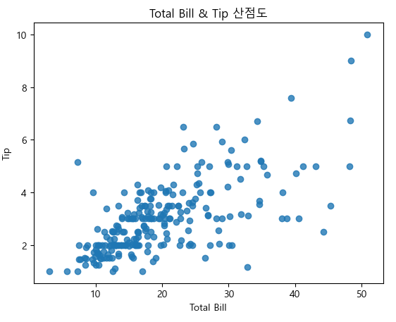
산점도 그래프
ax = sns.regplot(x = "total_bill", y = "tip", data = tips)
ax.set_title("Total Bill & Tip 산점도")
ax.set_xlabel("Total Bill")
ax.set_ylabel("Tip")
plt.show()

ax = sns.regplot(x = "total_bill", y = "tip", data = tips, fit_reg = False) # fit_reg = False : 회귀선 제외
ax.set_title("Total Bill & Tip 산점도")
ax.set_xlabel("Total Bill")
ax.set_ylabel("Tip")
plt.show()
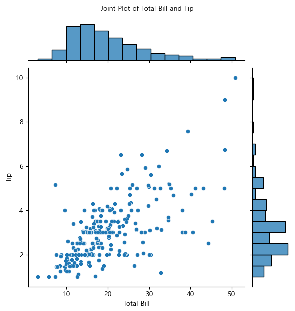
산점도와 히스토그램 한 번에 그리기
joint = sns.jointplot(x = "total_bill", y = "tip", data = tips)
joint.set_axis_labels(xlabel = "Total Bill", ylabel = "Tip")
joint.fig.suptitle("Joint Plot of Total Bill and Tip", fontsize = 10, y = 1.03)
plt.show()
- 산점도는 점이 겹칠 경우 구분하기 어려움 -> 육각 그래프
- 육각 그래프 : 2차원 표면에 육각형으로 데이터를 쌓아 표현, 특정 데이터의 개수가 많아지면 진한 색으로 표현
joint = sns.jointplot(x = "total_bill", y = "tip", data = tips, kind = "hex") # kind = "hex" 육각 그래프
joint.set_axis_labels(xlabel = "Total Bill", ylabel = "Tip")
joint.fig.suptitle("Joint Plot of Total Bill and Tip", fontsize = 10, y = 1.03)
plt.show()

# Tableau, powerBI 로 연습해보기
# 데이터 시각화 경진대회
이차원 밀집도
ax = sns.kdeplot(data = tips,
x = "total_bill",
y = "tip",
fill = True)
ax.set_title("이차원 밀집도 Total Bill & Tip")
ax.set_xlabel("Total Bill")
ax.set_ylabel("Tip")
plt.show()
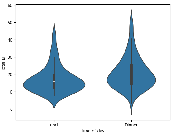
박스 그래프
tips.head()

ax = sns.boxplot(x = "time", y = "total_bill", data = tips)
ax.set_xlabel("Time of day")
ax.set_ylabel("Total Bill")
plt.show()

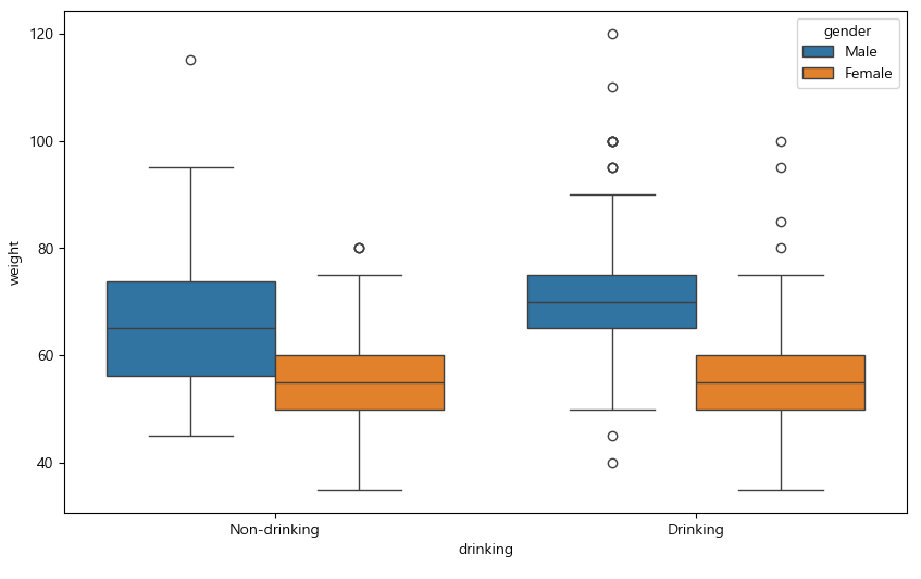
건강검진 데이터 음주 여부와 몸무게 상자수염 그래프
plt.figure(figsize = (10, 6))
sns.boxplot(data = health, x = "drinking", y = "weight", hue = "gender") # hue = "gender": 성별별로 나누어서 볼 수 있음
plt.show()
바이올린 그래프
ax = sns.violinplot(x = "time", y = "total_bill", data = tips)
ax.set_xlabel("Time of day")
ax.set_ylabel("Total Bill")
plt.show()
ax = sns.violinplot(x = "time", y = "total_bill", hue = "sex", data = tips, split = True)
# hue = "sex" :성별 별로 필터링 split = True: 반반씩 데이터를 나눠서 보여줌
ax.set_xlabel("Time of day")
ax.set_ylabel("Total Bill")
plt.show()

건강검진 데이터 성별 몸무게를 음주 여부로 분리한 바이올린 그래프
plt.figure(figsize = (10, 6))
sns.violinplot(data = health, x = "gender", y = "weight", hue = "drinking") # hue = "drinking" :음주 여부에 따라 분리
plt.show()

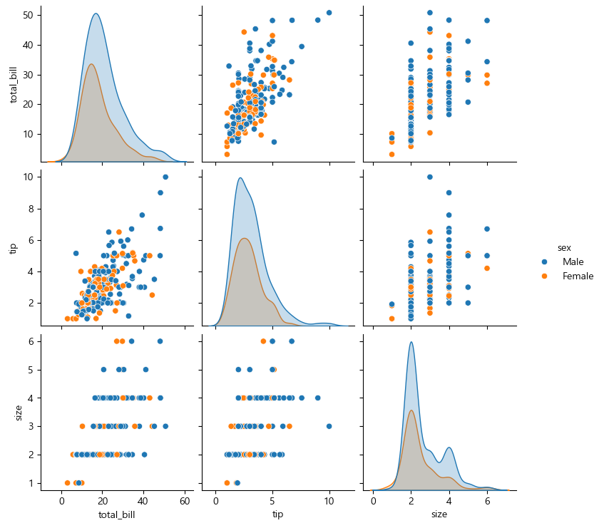
관계 그래프
sns.pairplot(tips)
plt.show()

pair_grid = sns.PairGrid(tips)
pair_grid = pair_grid.map_upper(sns.regplot) #산점도 그래프
pair_grid = pair_grid.map_diag(sns.histplot, kde = True) #히스토그램, 밀집도
pair_grid = pair_grid.map_lower(sns.kdeplot) #이차원 밀집도
plt.show()

산점도 관계 그래프 그리기
sns.lmplot(x = "total_bill", y = "tip", data = tips, fit_reg = False, hue = "sex") #lmplot은 그룹별 시각화가 가능(hue)
plt.show()

sns.pairplot(tips, hue = "sex")
plt.show()
FacetGrid로 그룹별 그래프 그리기
facet = sns.FacetGrid(tips, col = "time")
facet.map(sns.histplot, "total_bill", kde = True)
plt.show()

facet = sns.FacetGrid(tips, col = "day", hue = "sex")
facet = facet.map(plt.scatter, "total_bill", "tip")
facet = facet.add_legend()
plt.show()

facet = sns.FacetGrid(tips, col = "time", row = "smoker", hue = "sex")
facet.map(plt.scatter, "total_bill", "tip")
plt.show()

seaborn 스타일 설정
sns.set_style("darkgrid")
sns.violinplot(x = "time", y = "total_bill", hue = "sex", data = tips, split = True)
plt.show()

'07_Data_Analysis' 카테고리의 다른 글
| 06_시간 시각화 (0) | 2025.03.17 |
|---|---|
| 05_Folium(지도 시각화 도구) (1) | 2025.03.17 |
| 04_seaborn예제 (0) | 2025.03.16 |
| 03_Matplotlib예제 (1) | 2025.03.16 |
| 01_데이터 시각화 기초 (2) | 2025.03.12 |