728x90
데이터 시각화
- 데이터를 분석한 결과를 쉽게 이해할 수 있도록 표현하여 전달하는 것
- 데이터의 시각화가 필요한 이유
- 많은 양의 데이터를 한 눈에 살펴볼 수 있음
- 전문 지식이 없더라도 누구나 쉽게 데이터를 인지하고 사용할 수 있음
- 단순한 데이터의 요약이나 나열보다 더 정확한 데이터 분석 결과를 얻을 수 있음
- 단순한 데이터에서는 알 수 없었던 중요한 정보를 파악할 수 있음
파이썬의 시각화 라이브러리
(총5가지를 소개하고, 실습은 matplotlib와 seaborn을 사용)
- matplotlib(https://matplotlib.org/)
- 파이썬에서 가장 많이 사용하는 시각화 라이브러리
- 판다스의 데이터프레임을 바로 시각화할 때도 내부적으로 matplotlib을 사용
- 데이터 분석 이전의 데이터 이해를 위한 시각화 또는 데이터 분석 이후의 결과를 시각화하기 위해 사용
- seaborn(https://seaborn.pydata.org/)
- matplotlib을 기반으로 색 테마, 차트 기능 등을 추가해주는 라이브러리
- matplotlib과 함께 사용하며 히트맵, 카운트 플롯 등을 제공
- folium
- 지도 데이터를 이용하여 위치 정보를 시각화하는 라이브러리
- 자바스크립트 기반의 인터랙티브 그래프를 그릴 수 있음
- plotly
- 인터랙티브 그래프를 그려주는 라이브러리
- wordcloud
01. 시각화단계
- 시각화 라이브러리 불러오기
- x축, y축에 표시할 데이터 정하기
- plot() 함수에 데이터 입력하기
- 그래프 보여주기
import matplotlib.pyplot as plt
import numpy as np
import pandas as pd
import seaborn as sns
# Windows용 한글 폰트 오류 해결
from matplotlib import font_manager, rc
font_path = "C:/Windows/Fonts/malgun.ttf"
font_name = font_manager.FontProperties(fname = font_path).get_name()
rc("font", family = font_name)
# macOS용 한글 폰트 오류 해결
# from matplotlib import rc
# rc("font", family = "AppleGothic")
02. 그래프란
- 서로 연관성이 있는 1개 또는 그 이상의 양에 대한 상대 값을 도형으로 나타내는 것
- 데이터의 개수, 종류에 따른 그래프의 종류
- 일변량(데이터 개수가 1개)
- 연속형
- 히스토그램(histogram)
- 상자수염 그래프(boxplot)
- 바이올린 그래프(violin)
- 커널 밀도 그래프(kernel density curve)
- 범주형
- 막대 그래프(bar chart)
- 파이 그래프(pie chart)
- 연속형
- 다변량(데이터 개수가 2개 이상)
- 연속형
- 산점도(scatter plot)
- 선 그래프(line)
- 범주형
- 모자이크 그래프(mosaic graph)
- Tree Map 그래프
- 연속형
- 일변량(데이터 개수가 1개)
03. 기본 그래프
# 기본 시각화 문법
plt.plot([1, 2, 3, 4])
plt.ylabel("y축") # label: 종속변수
plt.show()
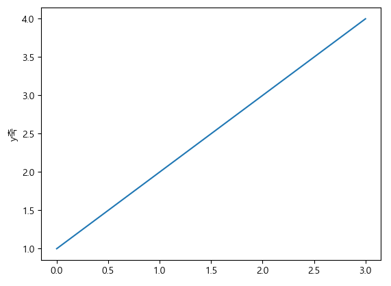
- 리스트의 값이 y값이라고 가정하고 x값을 자동으로 생성 [0, 1, 2, 3]
plt.plot([1, 2, 3, 4], [1, 4, 9, 16])
plt.show()

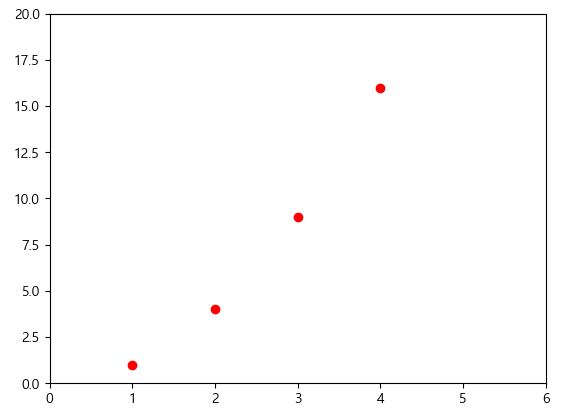
plt.plot([1, 2, 3, 4], [1, 4, 9, 16], "ro") # r:red, o:마커, -:선 (기본은 b-)
plt.axis([0, 6, 0, 20]) #xmin, xmax, ymin, ymax
plt.show()
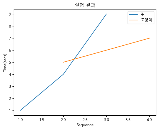
04. 범례 추가
plt.plot([1, 2, 3], [1, 4, 9])
plt.plot([2, 3, 4], [5, 6, 7])
plt.xlabel("Sequence")
plt.ylabel("Time(secs)")
plt.title("실험 결과")
plt.legend(["쥐", "고양이"])
plt.show()
05. 여러개의 그래프 그리기
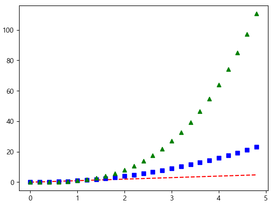
t = np.arange(0, 5, 0.2)
plt.plot(t, t, "r--", t, t ** 2, "bs", t, t ** 3, "g^") # **제곱
plt.show()
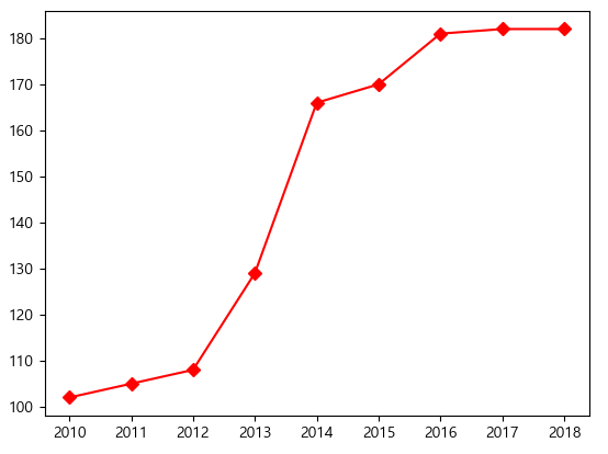
data = [102, 105, 108, 129, 166, 170, 181, 182, 182]
years = range(2010, 2019)
plt.plot(years, data, "rD-")
plt.show()
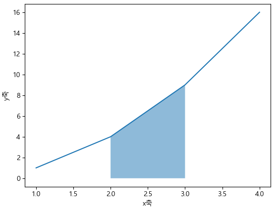
06. 그래프 영역 채우기
x = [1, 2, 3, 4]
y = [1, 4, 9, 16]
plt.plot(x, y)
plt.xlabel("x축")
plt.ylabel("y축")
plt.fill_between(x[1:3], y[1:3], alpha = 0.5) # alpha: 투명도 설정
plt.show()
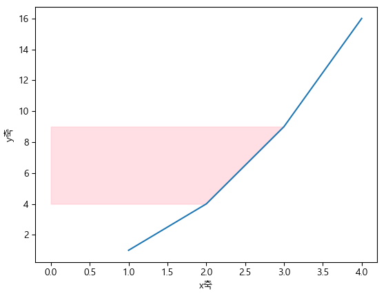
x = [1, 2, 3, 4]
y = [1, 4, 9, 16]
plt.plot(x, y)
plt.xlabel("x축")
plt.ylabel("y축")
plt.fill_betweenx(y[1:3], x[1:3], alpha = 0.5, color = "pink") # alpha: 투명도 설정
plt.show()
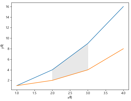
06-1. 두 그래프 사이 영역 채우기
x = [1, 2, 3, 4]
y1 = [1, 4, 9, 16]
y2 = [1, 2, 4, 8]
plt.plot(x, y1)
plt.plot(x, y2)
plt.xlabel("x축")
plt.ylabel("y축")
plt.fill_between(x[1:3], y1[1:3], y2[1:3], alpha = 0.5, color = "lightgray") # alpha: 투명도 설정
plt.show()
06-2. 임의의 영역 채우기
x = [1, 2, 3, 4]
y1 = [1, 4, 9, 16]
y2 = [1, 2, 4, 8]
plt.plot(x, y1)
plt.plot(x, y2)
plt.xlabel("x축")
plt.ylabel("y축")
plt.fill([1.9, 1.9, 3.1, 3.1], [2, 5, 11, 8], alpha = 0.5, color = "lightgray") # alpha: 투명도 설정
plt.show()

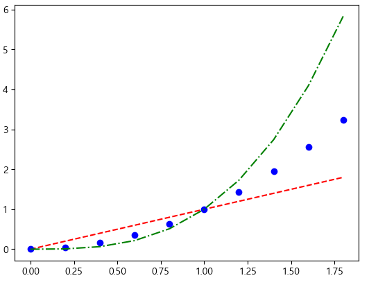
a = np.arange(0, 2, 0.2)
plt.plot(a, a, "r--", a, a ** 2, "bo", a, a ** 3, "g-.")
plt.show()
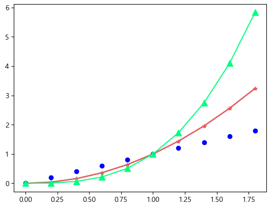
a = np.arange(0, 2, 0.2)
plt.plot(a, a, "bo")
plt.plot(a, a ** 2, color = "#e35f62", marker = "*", linewidth = 2)
plt.plot(a, a ** 3, color = "springgreen", marker = "^", markersize = 9)
plt.show()
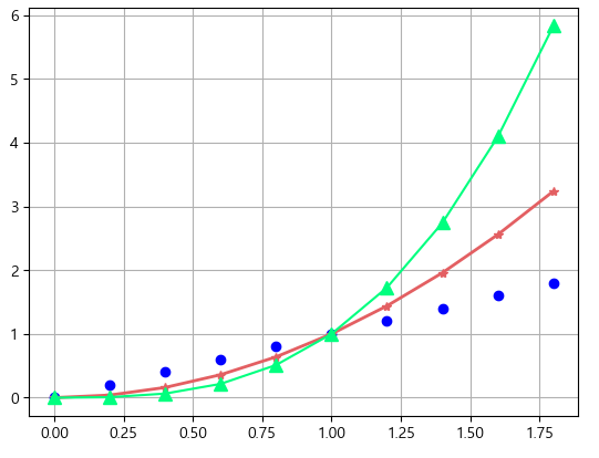
07. 격자 설정
a = np.arange(0, 2, 0.2)
plt.plot(a, a, "bo")
plt.plot(a, a ** 2, color = "#e35f62", marker = "*", linewidth = 2)
plt.plot(a, a ** 3, color = "springgreen", marker = "^", markersize = 9)
plt.grid() #격자 설정
plt.show()
a = np.arange(0, 2, 0.2)
plt.plot(a, a, "bo")
plt.plot(a, a ** 2, color = "#e35f62", marker = "*", linewidth = 2)
plt.plot(a, a ** 3, color = "springgreen", marker = "^", markersize = 9)
plt.grid(axis = "y", color = "red", alpha = 0.5, linestyle = "--") # y축만 격자 설정
plt.show()
08. 눈금 표시
a = np.arange(0, 2, 0.2)
plt.plot(a, a, "bo")
plt.plot(a, a ** 2, color = "#e35f62", marker = "*", linewidth = 2)
plt.plot(a, a ** 3, color = "springgreen", marker = "^", markersize = 9)
plt.xticks([0, 1, 2]) # x축의 눈금
plt.yticks(np.arange(1, 6)) # y축의 눈금
plt.show()
a = np.arange(0, 2, 0.2)
plt.plot(a, a, "bo")
plt.plot(a, a ** 2, color = "#e35f62", marker = "*", linewidth = 2)
plt.plot(a, a ** 3, color = "springgreen", marker = "^", markersize = 9)
plt.xticks([0, 1, 2]) # x축의 눈금
plt.xticks(np.arange(0, 2, 0.2), labels = ["Jan", "", "Feb", "", "Mar", "", "May", "", "June", ""]) # y축의 눈금
plt.yticks(np.arange(0, 7), ("0", "1GB", "2GB", "3GB", "4GB", "5GB", "6GB"))
plt.tick_params(axis = "x", direction = "in", length = 3, pad = 6, labelsize = 14, labelcolor = "green", top = True)
plt.tick_params(axis = "y", direction = "inout", length = 10, pad = 15, labelsize = 12, width = 2, color = "r")
#direction: 기본값은 out, in으로 하면 안쪽에만 눈금이 나온다
plt.show()
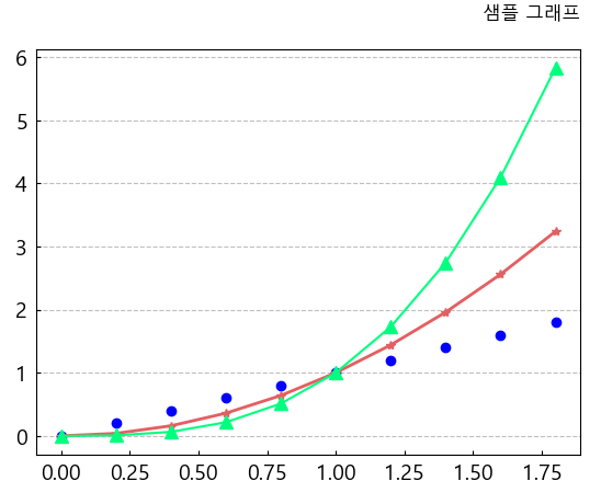
09. 제목 설정
a = np.arange(0, 2, 0.2)
plt.plot(a, a, "bo")
plt.plot(a, a ** 2, color = "#e35f62", marker = "*", linewidth = 2)
plt.plot(a, a ** 3, color = "springgreen", marker = "^", markersize = 9)
plt.grid(axis = "y", color = "gray", alpha = 0.5, linestyle = "--")
plt.tick_params(axis = "both", direction = "in", length = 3, pad = 6, labelsize = 14)
plt.title("샘플 그래프", loc = "right", pad = 20)
plt.show()
※ 3p(price, perpose, people)를 고려하여 그래프를 작성
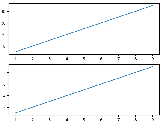
10. 서브 플롯
- plt.subplot(nrow, ncol, pos)줄, 칸, 위치
x = np.arange(1, 10)
y1 = x * 5
y2 = x * 1
plt.subplot(2, 1, 1)
plt.plot(x, y1)
plt.subplot(2, 1, 2)
plt.plot(x, y2)
plt.show()
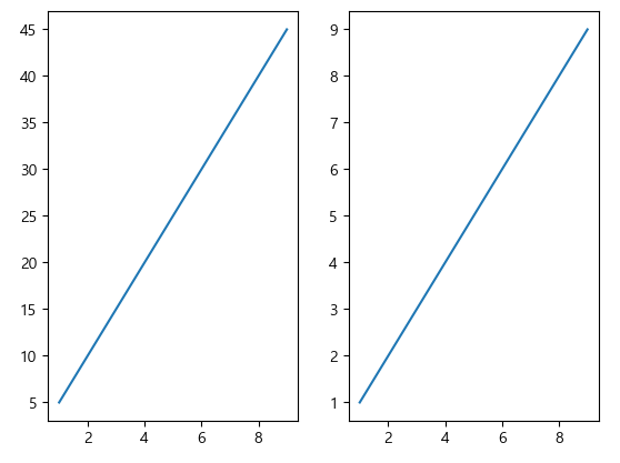
x = np.arange(1, 10)
y1 = x * 5
y2 = x * 1
plt.subplot(1, 2, 1)
plt.plot(x, y1)
plt.subplot(1, 2, 2)
plt.plot(x, y2)
plt.show()
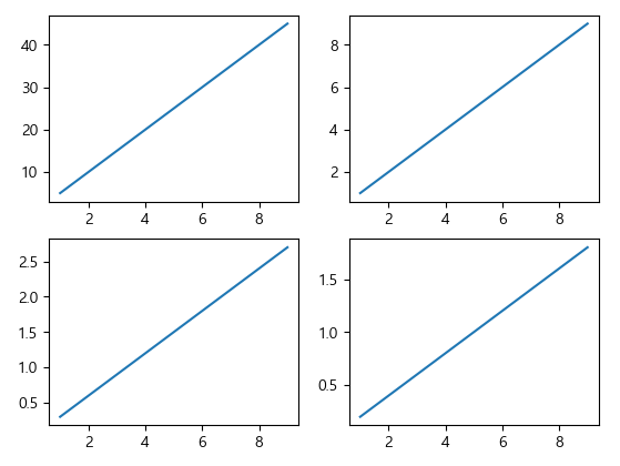
x = np.arange(1, 10)
y1 = x * 5
y2 = x * 1
y3 = x * 0.3
y4 = x * 0.2
plt.subplot(2, 2, 1)
plt.plot(x, y1)
plt.subplot(2, 2, 2)
plt.plot(x, y2)
plt.subplot(2, 2, 3)
plt.plot(x, y3)
plt.subplot(2, 2, 4)
plt.plot(x, y4)
plt.show()
- figure.add_subplot(nrow, ncol, pos)
fig = plt.figure()
ax1 = fig.add_subplot(1, 2, 1)
ax2 = fig.add_subplot(1, 2, 2)
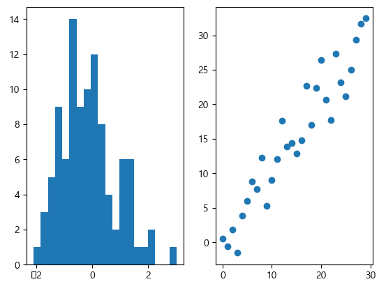
# hist: 히스토그램, scatter: 산점도
ax1.hist(np.random.randn(100), bins = 20)
ax2.scatter(np.arange(30), np.arange(30) + 3 * np.random.randn(30))
plt.show()
- plt.subplots(nrow, ncols)
fig, axes = plt.subplots(2, 2, figsize = (10, 8))
axes[0, 0].plot(np.random.rand(5))
axes[0, 0].set_title("axes 1")
axes[0, 1].plot(np.random.rand(5))
axes[0, 1].set_title("axes 2")
axes[1, 0].plot(np.random.rand(5))
axes[1, 0].set_title("axes 3")
axes[1, 1].plot(np.random.rand(5))
axes[1, 1].set_title("axes 4")
plt.show()
11. 데이터 시각화가 필요한 이유
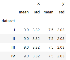
- 앤스콤 4분할 그래프로 확인하기
- 앤스콤 4분할 데이터는 각각 평균, 분산, 상관관계, 회귀선이 모두 같음
- 따라서 수칫값만을 확인한다면 각각의 데이터는 모두 같다 라는 착각을 할 수 있음
- 하지만 시각화하면 모든 데이터그룹들이 서로 다른 데이터패턴을 가짐
- 앤스콤 4분할 데이터는 각각 평균, 분산, 상관관계, 회귀선이 모두 같음
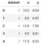
anscombe = sns.load_dataset("anscombe")
anscombe.head()
type(anscombe)
pandas.core.frame.DataFrameanscombe.groupby("dataset").agg(["mean", "std"]).round(2)
dataset_1 = anscombe[anscombe["dataset"] == "I"]
dataset_2 = anscombe[anscombe["dataset"] == "II"]
dataset_3 = anscombe[anscombe["dataset"] == "III"]
dataset_4 = anscombe[anscombe["dataset"] == "IV"]
plt.plot(dataset_1["x"], dataset_1["y"], "o")
plt.show()
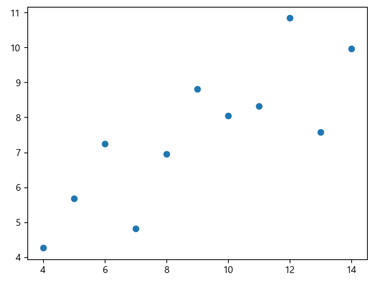
fig = plt.figure()
axes1 = fig.add_subplot(2, 2, 1)
axes2 = fig.add_subplot(2, 2, 2)
axes3 = fig.add_subplot(2, 2, 3)
axes4 = fig.add_subplot(2, 2, 4)
axes1.plot(dataset_1["x"], dataset_1["y"], "o")
axes2.plot(dataset_2["x"], dataset_2["y"], "o")
axes3.plot(dataset_3["x"], dataset_3["y"], "o")
axes4.plot(dataset_4["x"], dataset_4["y"], "o")
axes1.set_title("dataset_1")
axes2.set_title("dataset_2")
axes3.set_title("dataset_3")
axes4.set_title("dataset_4")
fig.suptitle("Anscombe Data") #super title
plt.tight_layout() #간격 재조정

'07_Data_Analysis' 카테고리의 다른 글
| 06_시간 시각화 (0) | 2025.03.17 |
|---|---|
| 05_Folium(지도 시각화 도구) (1) | 2025.03.17 |
| 04_seaborn예제 (0) | 2025.03.16 |
| 03_Matplotlib예제 (1) | 2025.03.16 |
| 02_그래프의 종류 (0) | 2025.03.12 |