728x90
import pandas as pd
import matplotlib.pyplot as plt
# Windows용 한글 폰트 오류 해결
from matplotlib import font_manager, rc
import matplotlib
font_path = "C:/Windows/Fonts/malgun.ttf"
font_name = font_manager.FontProperties(fname = font_path).get_name()
rc("font", family = font_name)
# - 가 나오지 않는 문제 해결
matplotlib.rcParams["axes.unicode_minus"] = False
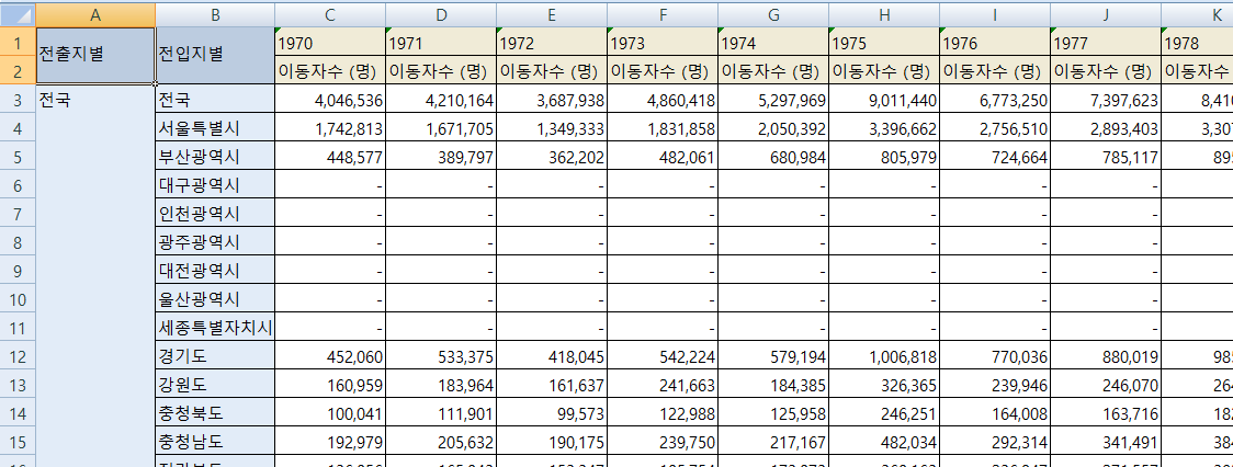
df = pd.read_excel("./data/시도별 전출입 인구수.xlsx")
df.head()

df.shape
(325, 50)
df.info()
<class 'pandas.core.frame.DataFrame'>
RangeIndex: 325 entries, 0 to 324
Data columns (total 50 columns):
 #   Column  Non-Null Count  Dtype
---  ------  --------------  -----
 0   전출지별    19 non-null     object
 1   전입지별    325 non-null    object
 2   1970    325 non-null    object
 3   1971    325 non-null    object
 4   1972    325 non-null    object
 5   1973    325 non-null    object
 6   1974    325 non-null    object
 7   1975    325 non-null    object
 8   1976    325 non-null    object
 9   1977    325 non-null    object
 10  1978    325 non-null    object
 11  1979    325 non-null    object
 12  1980    325 non-null    object
 13  1981    325 non-null    object
 14  1982    325 non-null    object
 15  1983    325 non-null    object
 16  1984    325 non-null    object
 17  1985    325 non-null    object
 18  1986    325 non-null    object
 19  1987    325 non-null    object
 20  1988    325 non-null    object
 21  1989    325 non-null    object
 22  1990    325 non-null    object
 23  1991    325 non-null    object
 24  1992    325 non-null    object
 25  1993    325 non-null    object
 26  1994    325 non-null    object
 27  1995    325 non-null    object
 28  1996    325 non-null    object
 29  1997    325 non-null    object
 30  1998    325 non-null    object
 31  1999    325 non-null    object
 32  2000    325 non-null    object
 33  2001    325 non-null    object
 34  2002    325 non-null    object
 35  2003    325 non-null    object
 36  2004    325 non-null    object
 37  2005    325 non-null    object
 38  2006    325 non-null    object
 39  2007    325 non-null    object
 40  2008    325 non-null    object
 41  2009    325 non-null    object
 42  2010    325 non-null    object
 43  2011    325 non-null    object
 44  2012    325 non-null    object
 45  2013    325 non-null    object
 46  2014    325 non-null    object
 47  2015    325 non-null    object
 48  2016    325 non-null    object
 49  2017    325 non-null    object
dtypes: object(50)
memory usage: 127.1+ KB
# 결측치 개수 확인(셀이 병합돼있어서 결측치로 나옴)
df.isna().sum()
전출지별    306
전입지별      0
1970      0
1971      0
1972      0
1973      0
1974      0
1975      0
1976      0
1977      0
1978      0
1979      0
1980      0
1981      0
1982      0
1983      0
1984      0
1985      0
1986      0
1987      0
1988      0
1989      0
1990      0
1991      0
1992      0
1993      0
1994      0
1995      0
1996      0
1997      0
1998      0
1999      0
2000      0
2001      0
2002      0
2003      0
2004      0
2005      0
2006      0
2007      0
2008      0
2009      0
2010      0
2011      0
2012      0
2013      0
2014      0
2015      0
2016      0
2017      0
dtype: int64
- 엑셀 파일에서 병합된 셀을 데이터프레임으로 변환할 때 적절한 값을 찾지 못해 전출지별 열에 결측치 발생
- 누락데이터 앞 행의 데이터로 채워야 함
# 결측치를 전 값으로 채우기
df = df.ffill()
df.head()

# 서울에서 다른 지역으로 이동한 데이터만 추출하여 정리
df_seoul = df[(df["전출지별"] == "서울특별시") & (df["전입지별"] != "서울특별시")]
df_seoul.head()
# 전부 전출지별: 서울특별시 이므로, 전출지별열을 삭제
df_seoul = df_seoul.drop("전출지별", axis = 1)
df_seoul.head()
df_seoul = df_seoul.rename({"전입지별" : "전입지"}, axis = 1)
df_seoul.head()
# 전입지를 인덱스로 지정
df_seoul = df_seoul.set_index("전입지")
df_seoul.head()

df_seoul.index
Index(['전국', '부산광역시', '대구광역시', '인천광역시', '광주광역시', '대전광역시', '울산광역시', '세종특별자치시',
       '경기도', '강원도', '충청북도', '충청남도', '전라북도', '전라남도', '경상북도', '경상남도',
       '제주특별자치도'],
      dtype='object', name='전입지')
# 서울에서 경기도로 이동한 데이터만 선택
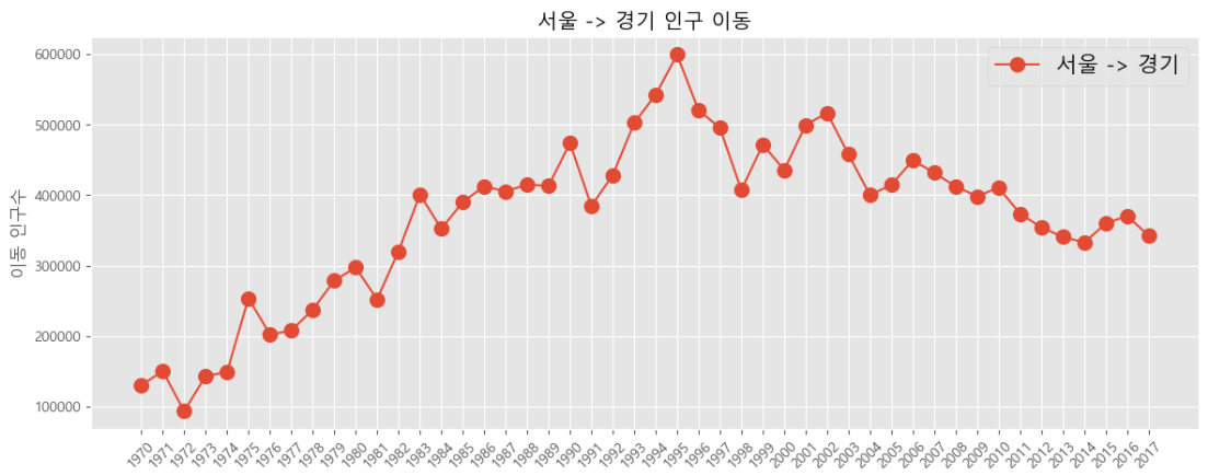
sr_gy = df_seoul.loc["경기도"]
sr_gy.head()
1970    130149
1971    150313
1972     93333
1973    143234
1974    149045
Name: 경기도, dtype: object
# 시리즈의 인덱스를 x축, 값을 y축으로 선 그래프 그리기
plt.plot(sr_gy)
plt.title("서울 -> 경기 인구 이동")
plt.xlabel("기간")
plt.ylabel("이동 인구수")
plt.show()

그래프 꾸미기
- 눈금 레이블이 들어갈 충분한 여유공간이 없으면 글씨가 겹치는 문제가 발생
- 문제 해결을 위한 방법
- figure() 로 공간을 만들기 위해 그래프의 가로 사이즈를 더 크게 설정
- xticks() 로 x축 눈금 레이블을 회전시켜서 글씨가 겹치기 않게 하기
plt.figure(figsize = (14, 5))
plt.plot(sr_gy)
plt.title("서울 -> 경기 인구 이동")
plt.xlabel("기간")
plt.ylabel("이동 인구수")
# plt.xticks(rotation = "vertical") # vertical: 레이블을 90도 회전
plt.xticks(rotation = 45) # vertical: 레이블을 45도 회전
plt.legend(labels = ["서울 -> 경기"]) # 범례 지정
plt.show()

# 스타일 서식 지정
plt.style.use("ggplot")
plt.figure(figsize = (14, 5))
plt.plot(sr_gy, marker = "o", markersize = 10)
plt.title("서울 -> 경기 인구 이동")
plt.xlabel("기간")
plt.ylabel("이동 인구수")
plt.xticks(rotation = 45)
plt.legend(labels = ["서울 -> 경기"], fontsize = 15)
plt.show()
# 그래프 객체 생성
fig = plt.figure(figsize = (20, 5))
ax = fig.add_subplot(1, 1, 1)
# axe 객체에 plot 함수로 그래프 출력
ax.plot(sr_gy, marker = "o", markerfacecolor = "orange", markersize = 10, color = "olive",
linewidth = 2, label = "서울 -> 경기")
ax.legend()
# y축 범위 지정
ax.set_ylim(50000, 800000)
# 차트 제목
ax.set_title("서울 -> 경기 인구 이동", size = 20)
# 축 이름 추가
ax.set_xlabel("기간", size = 12)
ax.set_ylabel("이동 인구수", size = 12)
# 축 눈금 레이블 지정 및 회전
ax.set_xticklabels(sr_gy.index, rotation = 75)
ax.tick_params(axis = "both", labelsize = 10)
plt.show()

# 연습 서울 -> 충남, 경북, 강원 인구 이동 그리기
df_seoul.index
Index(['전국', '부산광역시', '대구광역시', '인천광역시', '광주광역시', '대전광역시', '울산광역시', '세종특별자치시',
       '경기도', '강원도', '충청북도', '충청남도', '전라북도', '전라남도', '경상북도', '경상남도',
       '제주특별자치도'],
      dtype='object', name='전입지')
df_3 = df_seoul.loc[["충청남도", "경상북도","강원도"]]
# 그래프 객체 생성
fig = plt.figure(figsize = (20, 5))
ax = fig.add_subplot(1, 1, 1)
# axe 객체에 plot 함수로 그래프 출력
ax.plot(df_3.loc["충청남도"], marker = "o", markerfacecolor = "green", markersize = 10, color = "olive",
linewidth = 2, label = "서울 -> 충남")
ax.plot(df_3.loc["경상북도"], marker = "o", markerfacecolor = "blue", markersize = 10, color = "skyblue",
linewidth = 2, label = "서울 -> 경북")
ax.plot(df_3.loc["강원도"], marker = "o", markerfacecolor = "red", markersize = 10, color = "magenta",
linewidth = 2, label = "서울 -> 강원")
ax.legend()
# y축 범위 지정
# ax.set_ylim(50000, 800000)
# 차트 제목
ax.set_title("서울 -> 충남, 경북, 강원 인구 이동", size = 20)
# 축 이름 추가
ax.set_xlabel("기간", size = 12)
ax.set_ylabel("이동 인구수", size = 12)
# 축 눈금 레이블 지정 및 회전
ax.set_xticklabels(df_3.columns, rotation = 90)
ax.tick_params(axis = "both", labelsize = 10)
plt.show()

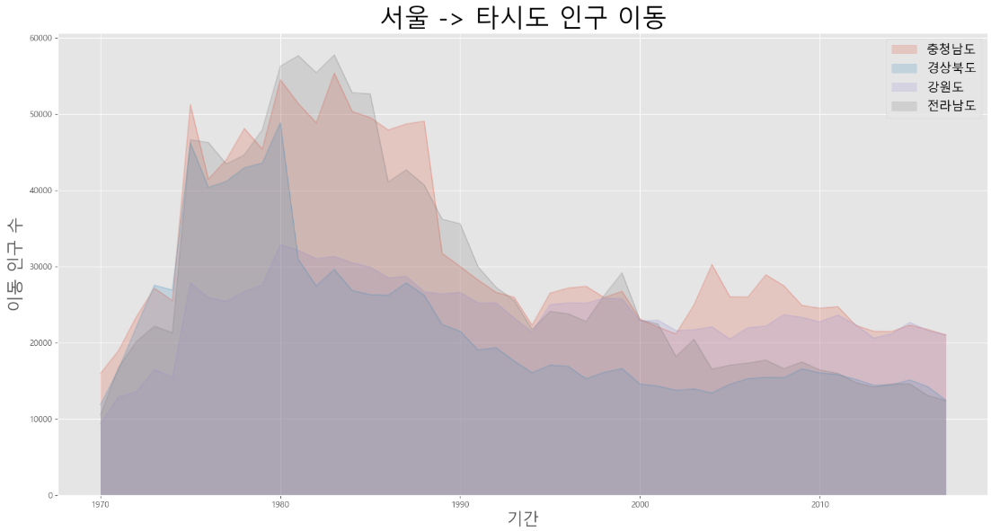
- 지리적으로 가까운 충남지역으로 이동한 인구가 다른 두 지역에 비해 많은 편
- 70 ~ 80년대에는 서울에서 지방으로 전출하는 인구가 많았으나 90년 이후로는 감소하는 패턴을 보임
면적 그래프(area plot)
- 각 열의 데이터를 선 그래프로 구현하는데, 선 그래프와 x축 사이의 공간에 색이 입혀짐
# 서울에서 "충남", "경북", "강원", "전남"으로 이동한 인구 데이터 값만 선택
df_4 = df_seoul.loc[["충청남도", "경상북도", "강원도", "전라남도"]]
df_4 = df_4.transpose()
# 면적 그래프 그리기
df_4.plot(kind = "area", stacked = False, alpha = 0.2, figsize = (20, 10))
plt.title("서울 -> 타시도 인구 이동", size = 30)
plt.ylabel("이동 인구 수", size = 20)
plt.xlabel("기간", size = 20)
plt.legend(fontsize = 15)
plt.show()
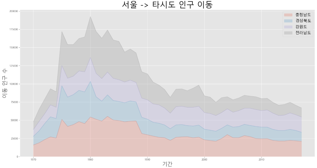
# 서울에서 "충남", "경북", "강원", "전남"으로 이동한 인구 데이터 값만 선택
df_4 = df_seoul.loc[["충청남도", "경상북도", "강원도", "전라남도"]]
df_4 = df_4.transpose()
# 면적 그래프 그리기
df_4.plot(kind = "area", stacked = True, alpha = 0.2, figsize = (20, 10))
# stacked = True 로 변경하면 누적 면적 그래프로 변경 가능
plt.title("서울 -> 타시도 인구 이동", size = 30)
plt.ylabel("이동 인구 수", size = 20)
plt.xlabel("기간", size = 20)
plt.legend(fontsize = 15)
plt.show()
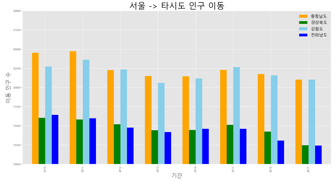
막대 그래프(bar plot)
- 데이터 값의 크기에 비례하여 높이를 갖는 직사각형 막대로 표현
- 막대 높이의 상대적 길이 차이를 통해 값의 크고 작음을 설명
- 세로형과 가로형 막대 그래프 두 종류가 있음
- 다만 세로형은 선 그래프와 정보 제공 측면에서 큰 차이는 없음
df_seoul.columns
Index(['1970', '1971', '1972', '1973', '1974', '1975', '1976', '1977', '1978',
       '1979', '1980', '1981', '1982', '1983', '1984', '1985', '1986', '1987',
       '1988', '1989', '1990', '1991', '1992', '1993', '1994', '1995', '1996',
       '1997', '1998', '1999', '2000', '2001', '2002', '2003', '2004', '2005',
       '2006', '2007', '2008', '2009', '2010', '2011', '2012', '2013', '2014',
       '2015', '2016', '2017'],
      dtype='object')
df_4 = df_seoul.loc[["충청남도", "경상북도", "강원도", "전라남도"], "2010":]
df_4 = df_4.T
# 막대 그래프 그리기
df_4.plot(kind = "bar", figsize = (20, 10), width = 0.7, color = ["orange", "green", "skyblue", "blue"])
plt.title("서울 -> 타시도 인구 이동", size = 30)
plt.xlabel("기간", size = 20)
plt.ylabel("이동 인구 수", size = 20)
plt.legend(fontsize = 15)
plt.ylim(10000, 30000)
plt.show()
- 가로형 막대 그래프는 각 변수 사이 값의 크기 차이를 설명하는데 적합
df_4 = df_seoul.loc[["충청남도", "경상북도", "강원도", "전라남도"], "2010":]
df_4.head()

# 2010 ~ 2017년 이동 인구 수를 합계하여 새로운 열로 추가
df_4["합계"] = df_4.sum(axis = 1)
df_4.head()

df_4["합계"].sort_values()
전입지
전라남도    116035
경상북도    117740
강원도     175731
충청남도    179533
Name: 합계, dtype: object
# 스타일 서식 지정
plt.style.use("ggplot")
# 수평 막대 그래프 그리기
df_4["합계"].sort_values().plot(kind = "barh", color = "cornflowerblue", width = 0.5, figsize = (10, 5))
# 합계라는 컬럼명
plt.title("서울 -> 타시도 인구 이동")
plt.ylabel("전입지")
plt.xlabel("이동 인구 수")
plt.show()

보조 축 활용
- 보조 축을 추가하여 2개의 y축을 갖는 그래프 그리기

df = pd.read_excel("../pandas/data/남북한발전전력량.xlsx")
df.head()

df = df.loc[5:]
df.head()

df = df.drop("전력량 (억㎾h)", axis = 1)
df = df.set_index("발전 전력별")
df = df.T
df.head()

# 증감율(변동률) 계산
df = df.rename(columns = {"합계" : "총발전량"})
# 직전 해의 값을 shift(1)을 사용하여 계산
df["총발전량 - 1년"] = df["총발전량"].shift(1)
df.head()

df["증감율"] = ((df["총발전량"] / df["총발전량 - 1년"]) - 1) * 100
df.head()

# 2축 그래프 그리기
ax1 = df[["수력", "화력"]].plot(kind = "bar", figsize = (20, 10), width = 0.7, stacked = True)
ax2 = ax1.twinx() # 원래 주어진 axis, x축을 공유하는 쌍둥이 axis
ax2.plot(df.index, df["증감율"], ls = "--", marker = "o", markersize = 20, color = "green", label = "전년대비 증감율(%)")
ax1.set_xlabel("연도", size = 20)
ax1.set_ylabel("발전량 (억㎾h)")
ax2.set_ylabel("전년 대비 증감율(%)")
plt.title("북한 전력 발전량 (1990 ~ 2016)", size = 30)
ax1.legend(loc = "upper left")
ax1.set_ylim(0, 500)
ax2.set_ylim(-50, 50)
plt.show()

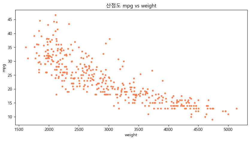
산점도(scatter plot)
- 서로 다른 두 변수 사이의 관계를 나타냄
- 2개의 연속 변수를 각각 x축과 y축에 하나씩 놓고 데이터 값이 위치하는 좌표를 찾아서 점으로 표시
- 두 연속 변수의 관계를 보여주는 점에서 선 그래프와 유사
- 선 그래프를 그릴 때 "o" 옵션 등으로 선 없이 점으로만 표현하면 사실상 산점도라고 볼 수 있음
df = pd.read_csv("../pandas/data/auto-mpg.csv", header = None)
s# 열 이름을 지정
df.columns = ["mpg", "cylinders", "displacement", "horsepower", "weight", "acceleration", "model_year", "origin", "name"]
df.head()
# 적용된 스타일 초기화
plt.style.use("default")
# 폰트 깨짐 현상도 초기화 되기 때문에 폰트 오류 해결 코드도 다시 실행
# 연비(mpg) 와 차중(weight) 열에 대한 산점도
df.plot(kind = "scatter", x = "weight", y = "mpg", c = "coral", s = 10, figsize = (10, 5))
plt.title("산점도 mpg vs weight")
plt.show()
- cylinders 변수를 점의 크기로 표현하여 추가
# cylinders의 상대적 비율을 계산하여 시리즈 생성
cylinders_size = df["cylinders"] / df["cylinders"].max() * 200
# 3개의 변수로 산점도 그리기
df.plot(kind = "scatter", x = "weight", y = "mpg", c = "coral", s = cylinders_size, figsize = (10, 5), alpha = 0.3)
plt.title("산점도 mpg vs weight")
plt.show()

# 색깔 변경
# cylinders의 상대적 비율을 계산하여 시리즈 생성
cylinders_size = df["cylinders"] / df["cylinders"].max()
# 3개의 변수로 산점도 그리기
df.plot(kind = "scatter", x = "weight", y = "mpg", c = cylinders_size, s = 50,
figsize = (10, 5), alpha = 0.3, marker = "+", cmap = "viridis")
plt.title("산점도 mpg vs weight")
# 그래프를 그림 파일로 저장
plt.savefig("./scatter.png")
# 저장되는 그림파일의 배경을 투명하게 설정
plt.savefig("./scatter_transparent.png", transparent = True)
plt.show()

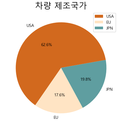
파이 차트(pie chart)
- 원을 파이 조각처럼 나누어서 표현
- 조각의 크기는 해당 변수에 속하는 데이터의 값의 크기에 비례
df_origin = df.groupby("origin").size()
# 제조국가 값을 실제 지역명으로 변경
df_origin.index = ["USA", "EU", "JPN"]
df_origin
USA    249
EU      70
JPN     79
dtype: int64
df_origin.plot(kind = "pie", figsize = (7, 5), autopct = "%.1f%%", startangle = 10, colors = ["chocolate", "bisque", "cadetblue"])
plt.title("차량 제조국가", size = 20)
plt.legend(labels = df_origin.index, loc = "upper right")
plt.show()
'07_Data_Analysis' 카테고리의 다른 글
| 06_시간 시각화 (0) | 2025.03.17 |
|---|---|
| 05_Folium(지도 시각화 도구) (1) | 2025.03.17 |
| 04_seaborn예제 (0) | 2025.03.16 |
| 02_그래프의 종류 (0) | 2025.03.12 |
| 01_데이터 시각화 기초 (2) | 2025.03.12 |