728x90
https://www.kaggle.com/competitions/bike-sharing-demand
자전거 대여 데이터
- 2011년부터 2012년까지 2년간의 자전거 대여 데이터
- 캐피털 바이크셰어 회사가 공개한 운행 기록에 다양한 외부 소스에서 얻은 당시 날씨 정보를 조합
- 한 시간 간격으로 기록됨
- 훈련 데이터 : 매달 1일부터 19일까지의 기록
- 테스트 데이터 : 매달 20일부터 월말까지의 기록
- 피처
- datetime : 기록 일시(1시간 간격)
- season : 계절(1 : 봄(1분기), 2 : 여름(2분기), 3 : 가을(3분기), 4 : 겨울(4분기))
- 공식 문서에는 계절로 설명하고 있지만 실제로는 분기로 나누어져 있음
- holiday : 공휴일 여부(0 : 공휴일 아님, 1 : 공휴일)
- workingday : 근무일 여부(0 : 근무일 아님, 1 : 근무일)
- 주말과 공휴일이 아니면 근무일이라고 간주
- weather : 날씨(1 : 맑음, 2 : 옅은 안개, 약간 흐림, 3 : 약간의 눈, 약간의 비와 천둥 번개, 흐림, 4: 폭우와 천둥 번개, 눈과 짙은 안개)
- 숫자가 클수록 날씨가 안 좋음
- temp : 실제 온도
- atemp : 체감 온도
- humidity : 상대 습도
- windspeed : 풍속
- casual : 등록되지 않은 사용자(비회원) 수
- registered : 등록된 사용자(회원) 수
- count : 자전거 대여 수량
- 종속변수 : count
- 평가지표 : RMSLE(Root Mean Squared Logarithmic Error)
import pandas as pd
import calendar
import seaborn as sns
import matplotlib.pyplot as plt
import numpy as np
# 평가지표
def rmsle(y_true, y_pred):
# 로그 변환 후 결측값을 0으로 변환
log_true = np.nan_to_num(np.log(y_true + 1))
log_pred = np.nan_to_num(np.log(y_pred + 1))
# RMSLE 계산
output = np.sqrt(np.mean((log_true - log_pred)**2))
return output
# 평가지표 수정
def rmsle(y_true, y_pred, convert_exp = True):
'''
실제 타깃값과 예측값을 인수로 전달하면 RMSLE 수치를 반환하는 함수
convert_exp : 입력 데이터를 지수변환할지 정하는 파라미터
타깃값으로 log(count)를 사용한 경우에는 지수변환을 해줘야 함
'''
# 지수 변환
if convert_exp:
y_true = np.exp(y_true)
y_pred = np.exp(y_pred)
# 로그 변환 후 결측값을 0으로 변환
log_true = np.nan_to_num(np.log(y_true + 1))
log_pred = np.nan_to_num(np.log(y_pred + 1))
# RMSLE 계산
output = np.sqrt(np.mean((log_true - log_pred)**2))
return output
데이터 확인
train_df = pd.read_csv("./data/bike/train.csv")
test_df = pd.read_csv("./data/bike/test.csv")
submission_df = pd.read_csv("./data/bike/sampleSubmission.csv")
train_df.head()

test_df.head()

submission_df.head()

train_df.shape, test_df.shape, submission_df.shape
((10886, 12), (6493, 9), (6493, 2))
train_df.info()
<class 'pandas.core.frame.DataFrame'>
RangeIndex: 10886 entries, 0 to 10885
Data columns (total 12 columns):
 #   Column      Non-Null Count  Dtype
---  ------      --------------  -----
 0   datetime    10886 non-null  object
 1   season      10886 non-null  int64
 2   holiday     10886 non-null  int64
 3   workingday  10886 non-null  int64
 4   weather     10886 non-null  int64
 5   temp        10886 non-null  float64
 6   atemp       10886 non-null  float64
 7   humidity    10886 non-null  int64
 8   windspeed   10886 non-null  float64
 9   casual      10886 non-null  int64
 10  registered  10886 non-null  int64
 11  count       10886 non-null  int64
dtypes: float64(3), int64(8), object(1)
memory usage: 1020.7+ KB
- 결측값 없음
- datetime은 날짜인데 object로 표현되어 전처리가 필요함
- 날짜, 연도, 월, 일, 시 로 각각 컬럼 생성
test_df.info()
<class 'pandas.core.frame.DataFrame'>
RangeIndex: 6493 entries, 0 to 6492
Data columns (total 9 columns):
 #   Column      Non-Null Count  Dtype
---  ------      --------------  -----
 0   datetime    6493 non-null   object
 1   season      6493 non-null   int64
 2   holiday     6493 non-null   int64
 3   workingday  6493 non-null   int64
 4   weather     6493 non-null   int64
 5   temp        6493 non-null   float64
 6   atemp       6493 non-null   float64
 7   humidity    6493 non-null   int64
 8   windspeed   6493 non-null   float64
dtypes: float64(3), int64(5), object(1)
memory usage: 456.7+ KB
데이터 분석
datetime 구성요소별로 나누기
train_df.head()

train_df["datetime"][0]
'2011-01-01 00:00:00'
train_df["datetime"][0].split()[0].split("-")
['2011', '01', '01']
train_df["datetime"][0].split()[1].split(":")
['00', '00', '00']
train_df["date"] = train_df["datetime"].map(lambda x: x.split()[0])
train_df["year"] = train_df["datetime"].map(lambda x: x.split()[0].split("-")[0])
train_df["month"] = train_df["datetime"].map(lambda x: x.split()[0].split("-")[1])
train_df["day"] = train_df["datetime"].map(lambda x: x.split()[0].split("-")[2])
train_df["hour"] = train_df["datetime"].map(lambda x: x.split()[1].split(":")[0])
train_df.head()
pd.to_datetime(train_df["date"])[0]
Timestamp('2011-01-01 00:00:00')
pd.to_datetime(train_df["date"])[0].weekday()
5
# 캘린더에서 요일 이름 추출
calendar.day_name[pd.to_datetime(train_df["date"])[0].weekday()]
'Saturday'
train_df["weekday"] = train_df["date"].map(lambda x: calendar.day_name[pd.to_datetime(x).weekday()])
train_df.head()

season, weather 범주형 데이터 문자열로 변환
train_df["season"] = train_df["season"].map({1 : "Spring",
2 : "Summer",
3 : "Fall",
4 : "Winter"})
train_df["weather"] = train_df["weather"].map({1 : "Clear",
2 : "Mist, Few clouds",
3 : "Light Snow, Rain, Thunder",
4 : "Heavy Snow, Rain, Thunder"})
train_df.head()

정리
- date 컬럼의 정보는 year, month, day에도 있어서 제거하는 편이 더 나을 수 있음
- month 컬럼은 세 달씩 묶으면 season이 되기 때문에 연관성이 너무 높아서 제거하는 편이 더 나을 수 있음
데이터 시각화
종속변수 분포도
# count의 최솟값이 1임
train_df.describe()

sns.histplot(train_df["count"])
plt.show()
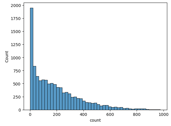
- 회귀 모델이 좋은 성능을 내기 위해서는 데이터가 정규분포를 따르는 것이 좋은데 0 근처에 몰려있음
sns.histplot(np.log(train_df["count"]))
plt.show()
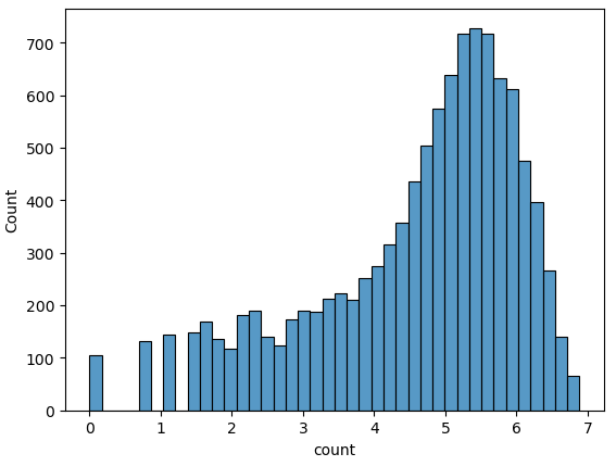
- log 변환하면 큰 값은 더 많이 줄이고 작은 값은 조금만 줄여서 전체 범위가 줄어듦
- count로 예측하는 것 보다 log(count)로 예측하는 것이 더 정확할 수 있음
- log(count)로 예측하면 예측값에 지수변환하여 실제값인 count로 복원해야함
시간관련 컬럼과 종속변수 관계
# 3행 2열 Figure 준비
fig, axes = plt.subplots(2, 2, figsize = (15, 15))
# 각 축에 서브플롯 할당
# 각 축에 연도, 월, 일, 시 별 평균 대여 수량 막대 그래프 할당
sns.barplot(x = "year", y = "count", data = train_df, ax = axes[0, 0])
sns.barplot(x = "month", y = "count", data = train_df, ax = axes[0, 1])
sns.barplot(x = "day", y = "count", data = train_df, ax = axes[1, 0])
sns.barplot(x = "hour", y = "count", data = train_df, ax = axes[1, 1])
# 서브플롯 제목
axes[0, 0].set(title = "Rental amounts by year")
axes[0, 1].set(title = "Rental amounts by month")
axes[1, 0].set(title = "Rental amounts by day")
axes[1, 1].set(title = "Rental amounts by hour")
plt.tight_layout() # 그래프 사이 여백 확보
plt.show()

- 2011년보다 2012년 대여량이 더 많음
- 6월에 가장 대여량이 많고 1월에 가장 적음
- 날씨가 따뜻할수록 대여 수량이 많을 수 있음
- day는 일별 대여량에 큰 차이가 없고 훈련데이터와 테스트데이터의 day값이 다르기 때문에 제거해야함
- 새벽 4시에 가장 대여량이 적고 아침 8시와 5 ~ 6시 대여량이 가장 많음
범주형 데이터 시각화
# 2행 2열 Figure 준비
fig, axes = plt.subplots(2, 2, figsize = (10, 10))
# 서브플롯 할당
# 계절, 날씨, 공휴일, 근무일별 대여 수량 박스플롯
sns.boxplot(x = "season", y = "count", data = train_df, ax = axes[0, 0])
sns.boxplot(x = "weather", y = "count", data = train_df, ax = axes[0, 1])
sns.boxplot(x = "holiday", y = "count", data = train_df, ax = axes[1, 0])
sns.boxplot(x = "workingday", y = "count", data = train_df, ax = axes[1, 1])
# 서브플롯 제목
axes[0, 0].set(title = "BoxPlot on Count Across Season")
axes[0, 1].set(title = "BoxPlot on Count Across Weather")
axes[1, 0].set(title = "BoxPlot on Count Across Holiday")
axes[1, 1].set(title = "BoxPlot on Count Across Working Day")
# x축 레이블 겹침 해결
axes[0, 1].tick_params("x", labelrotation = 10) # 10도 회전
plt.tight_layout()
plt.show()

- 봄에 대여량이 가장 적고 가을에 가장 많음
- 날씨가 좋을 때 가장 대여량이 많고 날씨가 안좋아질수록 대여량이 적음
- 공휴일이 아닐 때와 공휴일일 때 대여량의 중앙값은 거의 비슷하지만 공휴일이 아닐 때에는 이상치가 많음
- 근무일로 봐도 마찬가지로 근무일일 때 이상치가 많음
시간대별 평균 대여수량
fig, axes = plt.subplots(5, figsize = (12, 20)) # 5행 1열
sns.pointplot(x = "hour", y = "count", data = train_df, hue = "workingday", ax = axes[0])
sns.pointplot(x = "hour", y = "count", data = train_df, hue = "holiday", ax = axes[1])
sns.pointplot(x = "hour", y = "count", data = train_df, hue = "weekday", ax = axes[2])
sns.pointplot(x = "hour", y = "count", data = train_df, hue = "season", ax = axes[3])
sns.pointplot(x = "hour", y = "count", data = train_df, hue = "weather", ax = axes[4])
plt.tight_layout()
plt.show()

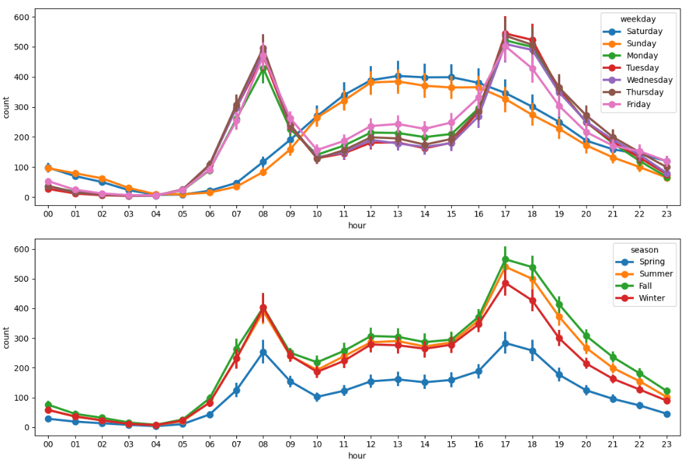

- 근무일에는 출퇴근 시간에 대여량이 많고 쉬는 날에는 오후 12 ~ 2시에 대여량이 많음
- 공휴일, 요일에 따른 그래프도 근무일 여부에 따른 그래프와 유사함
- 가을에 가장 대여량이 많고 봄에 가장 적음
- 날씨가 좋을 때 가장 대여량이 많음
- 폭우, 폭설이 내릴 때 저녁 6시에 대여건수가 있음
- 이상치로 처리하는 것이 더 좋을 수 있음
- 폭우, 폭설이 내릴 때 저녁 6시에 대여건수가 있음
날씨 데이터 시각화
fig, axes = plt.subplots(2, 2, figsize = (10, 6))
sns.regplot(x = "temp", y = "count", data = train_df, ax = axes[0, 0],
scatter_kws = {"alpha" : 0.2}, line_kws = {"color" : "blue"})
sns.regplot(x = "atemp", y = "count", data = train_df, ax = axes[0, 1],
scatter_kws = {"alpha" : 0.2}, line_kws = {"color" : "blue"})
sns.regplot(x = "windspeed", y = "count", data = train_df, ax = axes[1, 0],
scatter_kws = {"alpha" : 0.2}, line_kws = {"color" : "blue"})
sns.regplot(x = "humidity", y = "count", data = train_df, ax = axes[1, 1],
scatter_kws = {"alpha" : 0.2}, line_kws = {"color" : "blue"})
plt.tight_layout()
plt.show()
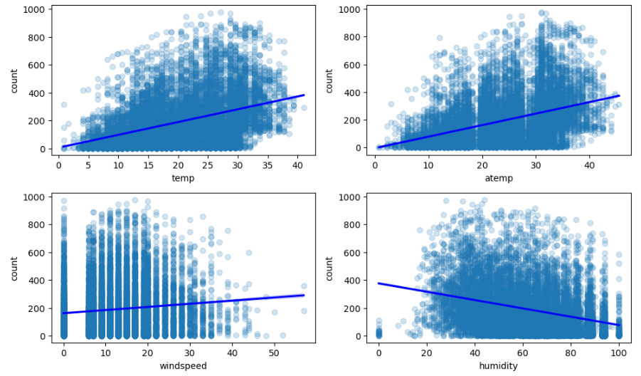
- 실제 온도와 체감 온도가 높을수록 대여량이 많음
- 습도가 낮을수록 대여량이 많음
- 풍속은 셀수록 대여량이 많음
- 풍속이 0인 데이터가 많고 풍속이 비어있는 구간이 있어 관측 오류가 의심됨
- 이상값 대체를 하거나 컬럼 삭제를 고려해야함
- 풍속이 0인 데이터가 많고 풍속이 비어있는 구간이 있어 관측 오류가 의심됨
- 추가로 상관계수를 확인해야함
상관계수
# 수치형 컬럼만 선택
train_df[["temp", "atemp", "humidity", "windspeed", "count"]].corr()

# windspeed의 상관계수가 0.101369 으로 제거하는게 나을 수 있음
# 피처 간 상관관계 히트맵
corr_mat = train_df[["temp", "atemp", "humidity", "windspeed", "count"]].corr()
fig.ax = plt.subplots(figsize = (10, 10))
sns.heatmap(corr_mat, annot = True)
plt.show()
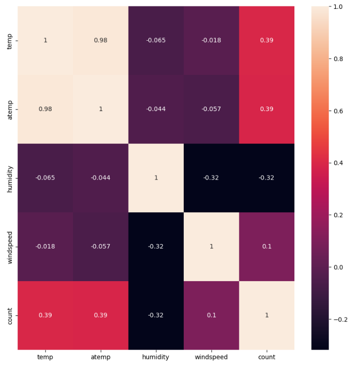
- 풍속은 상관관계가 매우 약해서 모델 학습에 악영향을 줄 수 있음
정리
- 종속변수를 로그변환하여 정규분포에 가깝게 변환한 후 모델 학습
- datetime 컬럼은 여러 정보의 혼합체이기 때문에 각각 연도, 월, 일, 시간 컬럼으로 분리
- 테스트 데이터에 없는 casual과 registered 는 삭제
- datetime은 인덱스 역할만 하기 때문에 삭제
- date 컬럼이 제공하는 정보는 모두 year, month, day 로 분리했기 때문에 삭제
- month 는 season의 세부 분류로 볼 수 있음
- 데이터가 지나치게 세분화되면 분류별 데이터 수가 적어져 오히려 학습에 방해될 수 있어서 제거
- day 는 분별력이 없어서 제거
- weather 가 4인 경우는 이상치 처리
- windspeed 컬럼은 결측값이 많고 대여량과의 관계가 매우 약해서 제거
'08_ML(Machine_Learning)' 카테고리의 다른 글
| 32_자전거 대여 수요 예측(2) (1) | 2025.04.18 |
|---|---|
| 31_피마인디언 당뇨병 예측 (0) | 2025.04.16 |
| 30_머신러닝 프로젝트 프로세스(머신러닝 모델링 프로세스) (0) | 2025.04.15 |
| scikit-learn algorithm cheat sheet(사이킷런 알고리즘 치트시트) (0) | 2025.04.14 |
| 29_군집분석_연습문제 (0) | 2025.04.14 |