07_Data_Analysis
04_seaborn예제
chuuvelop
2025. 3. 16. 02:34
728x90
import seaborn as sns
import matplotlib.pyplot as plt
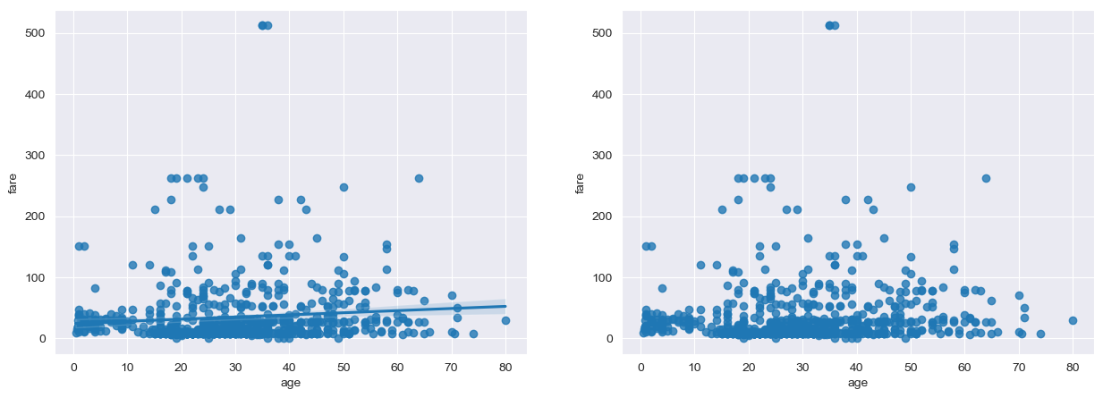
회귀선이 있는 산점도
titanic = sns.load_dataset("titanic")
# 스타일 테마 설정
sns.set_style("darkgrid")
fig = plt.figure(figsize = (15, 5))
ax1 = fig.add_subplot(1, 2, 1)
ax2 = fig.add_subplot(1, 2, 2)
# 선형회귀선 표시
sns.regplot(x = "age", # x축 변수
y = "fare", # y축 변수
data = titanic, # 데이터
ax = ax1) # axe 객체 - 1번째 그래프
# 선형회귀선 미표시
sns.regplot(x = "age",
y = "fare",
data = titanic,
ax = ax2,
fit_reg = False) # 회귀선 미표시
plt.show()
히스토그램/커널 밀도 그래프
fig = plt.figure(figsize = (15, 5))
ax1 = fig.add_subplot(1, 3, 1)
ax2 = fig.add_subplot(1, 3, 2)
ax3 = fig.add_subplot(1, 3, 3)
sns.histplot(titanic["fare"], ax = ax1, kde = True)
# titanic["fare"] 이렇게 써도됨. seaborn은 x = "fare", data = titanic 이렇게 쓰는 방식이 주력
sns.kdeplot(x = "fare", data = titanic, ax = ax2)
sns.histplot(x = "fare", data = titanic, ax = ax3)
plt.show()

히트맵
- 2개의 범주형 변수를 각각 x축, y축에 놓고 데이터를 행렬 형태로 분류하여 시각화
# 피벗테이블로 범주형 변수를 각각 행, 열로 재구분하여 정리
table = titanic.pivot_table(index = "sex", columns = "class", aggfunc = "size", observed = False)
table

titanic[(titanic["class"] == "First") & (titanic["sex"] == "female")].shape
(94, 15)
# 히트맵 그리기
sns.heatmap(table,
annot = True, fmt = "d", # 데이터 값 표시 여부, 정수형(digit) 포맷
linewidth = .5, # 구분 선
cbar = True, # 컬러 바 표시 여부
cmap = "YlGnBu") # 컬러 맵
plt.show()

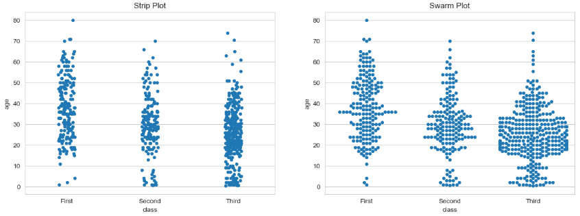
범주형 데이터의 산점도
- 범주형 변수에 들어 있는 각 범주별 데이터의 분포를 확인
- stripplot()
- 데이터 분산 미고려(중복 표시 있음)
- swarmplot()
- 데이터의 분산을 고려하여 데이터 포인트가 서로 중복되지 않도록 시각화
- 데이터가 퍼져 있는 정도를 입체적으로 볼 수 있음
- stripplot()
sns.set_style("whitegrid")
fig = plt.figure(figsize = (15, 5))
ax1 = fig.add_subplot(1, 2, 1)
ax2 = fig.add_subplot(1, 2, 2)
# 이산형 변수의 분포 - 데이터 분산 미고려
sns.stripplot(x = "class", # x축 변수
y = "age", # y축 변수
data = titanic, # 데이터셋
ax = ax1) # axe 객체 - 1번째 그래프
# 이산형 변수의 분포 - 데이터 분산 고려(중복 X)
sns.swarmplot(x = "class",
y = "age",
data = titanic,
ax = ax2)
ax1.set_title("Strip Plot")
ax2.set_title("Swarm Plot")
plt.show()
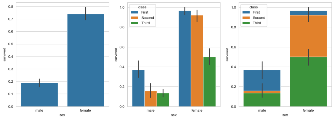
막대 그래프
titanic.head()
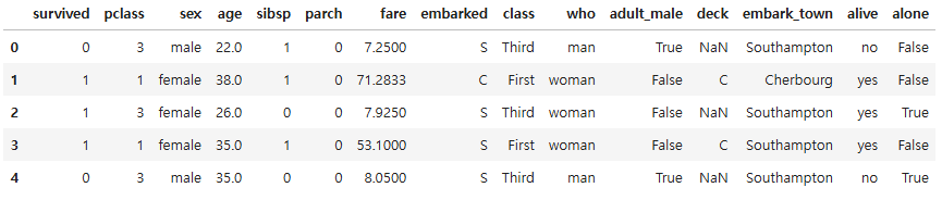
fig = plt.figure(figsize = (15, 5))
ax1 = fig.add_subplot(1, 3, 1)
ax2 = fig.add_subplot(1, 3, 2)
ax3 = fig.add_subplot(1, 3, 3)
sns.barplot(x = "sex", y = "survived", data = titanic, ax = ax1)
sns.barplot(x = "sex", y = "survived", hue = "class", data = titanic, ax = ax2)
sns.barplot(x = "sex", y = "survived", hue = "class", dodge = False, data = titanic, ax = ax3)
# dodge = False :겹쳐서 누적
plt.show()
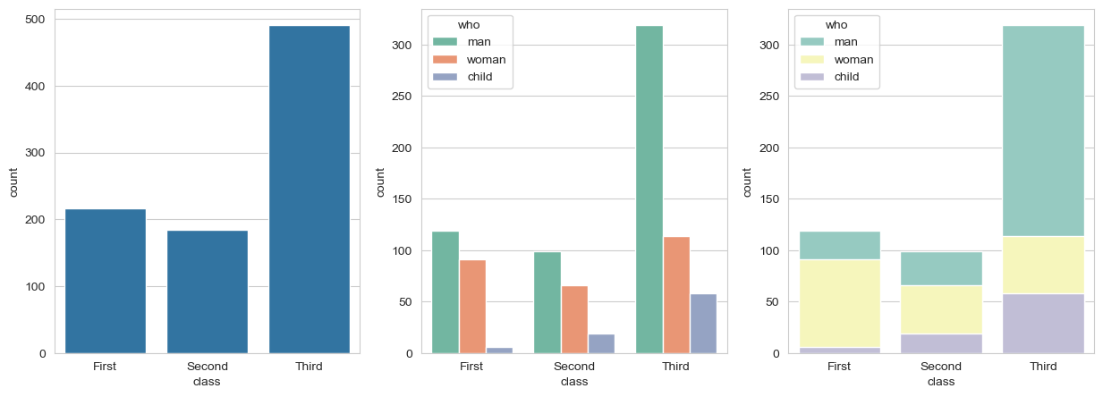
빈도 그래프
fig = plt.figure(figsize = (15, 5))
ax1 = fig.add_subplot(1, 3, 1)
ax2 = fig.add_subplot(1, 3, 2)
ax3 = fig.add_subplot(1, 3, 3)
# 기본 빈도 그래프
# sns.countplot(x = "class", palette = "Set1", data = titanic, ax = ax1)
sns.countplot(x = "class", data = titanic, ax = ax1)
# hue 옵션에 "who" 추가
sns.countplot(x = "class", hue = "who", palette = "Set2", data = titanic, ax = ax2)
# dodge = False 옵션 추가(축 방향으로 분리하지 않고 누적 그래프 출력)
sns.countplot(x = "class", hue = "who", palette = "Set3", dodge = False, data = titanic, ax = ax3)
plt.show()
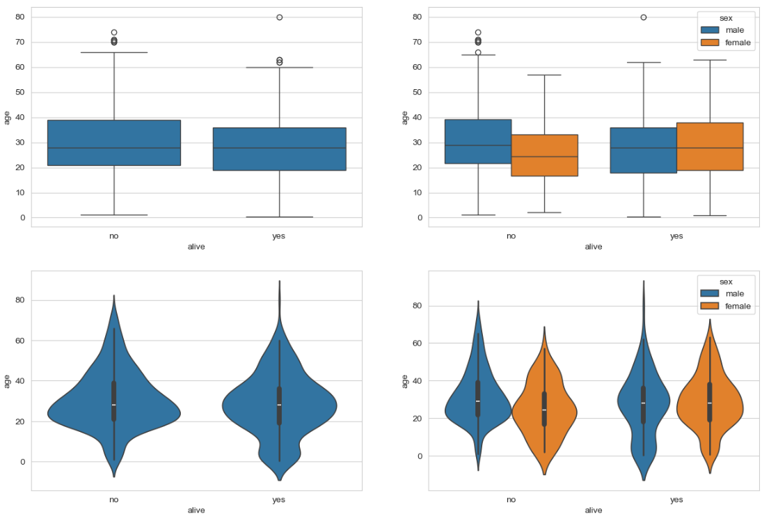
박스 플롯 / 바이올린 그래프
- 박스 플롯: 범주형 데이터 분포와 주요 통계 지표를 함께 제공
- 다만 박스 플롯 만으로는 데이터가 퍼져 있는 분산의 정도를 정확하게 알기 어렵기 때문에 커널 밀도 함수 그래프를 y축 방향에 추가하여 바이올린 그래프를 그리는 경우도 있음
fig = plt.figure(figsize = (15, 10))
ax1 = fig.add_subplot(2, 2, 1)
ax2 = fig.add_subplot(2, 2, 2)
ax3 = fig.add_subplot(2, 2, 3)
ax4 = fig.add_subplot(2, 2, 4)
sns.boxplot(x = "alive", y = "age", data = titanic, ax = ax1)
sns.boxplot(x = "alive", y = "age", hue = "sex", data = titanic, ax = ax2)
sns.violinplot(x = "alive", y = "age", data = titanic, ax = ax3)
sns.violinplot(x = "alive", y = "age", hue = "sex", data = titanic, ax = ax4)
plt.show()
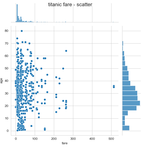
조인트 그래프
# 조인트 그래프 - 산점도(기본값)
j1 = sns.jointplot(x = "fare", y = "age", data = titanic)
j1.fig.suptitle("titanic fare - scatter", size = 15)
plt.show()
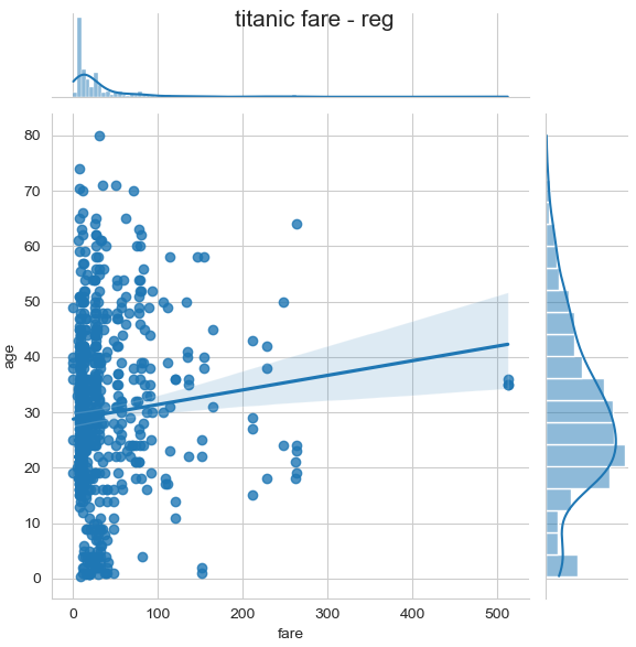
# 조인트 그래프 - 회귀선
j2 = sns.jointplot(x = "fare", y = "age", kind = "reg", data = titanic)
j2.fig.suptitle("titanic fare - reg", size = 15)
plt.show()
# 조인트 그래프 - 육각 그래프
j3 = sns.jointplot(x = "fare", y = "age", kind = "hex", data = titanic)
j3.fig.suptitle("titanic fare - hex", size = 15)
plt.show()

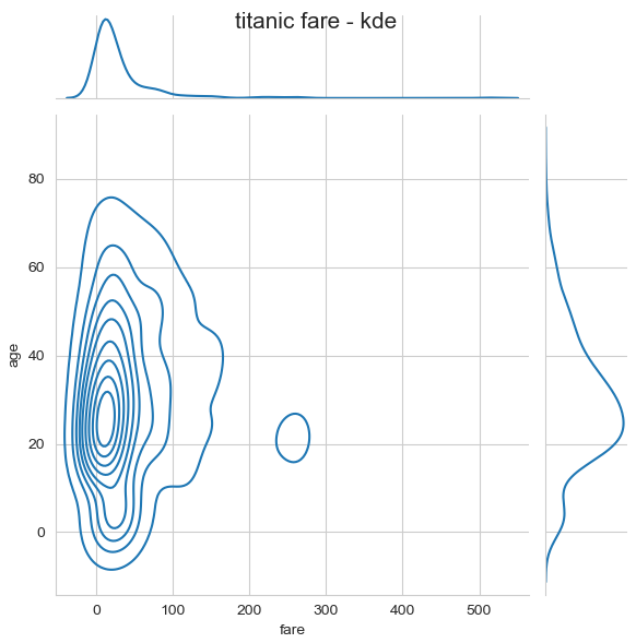
# 조인트 그래프 - 커널 밀집 그래프
j3 = sns.jointplot(x = "fare", y = "age", kind = "kde", data = titanic)
j3.fig.suptitle("titanic fare - kde", size = 15)
plt.show()
728x90